Dropping in with a rare Monday post because the paint colors for the Heights House have officially been chosen and I couldn’t wait to share!
A few weeks ago I shared our decision for the exterior color, which was painted SW Oyster White.
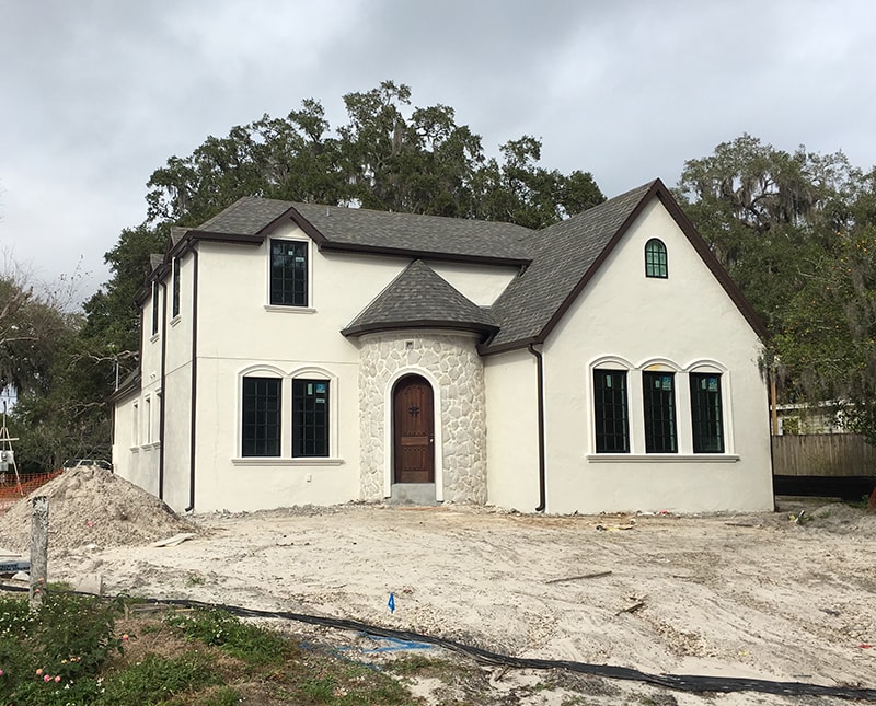
But I also needed to find a color for our new window trim.
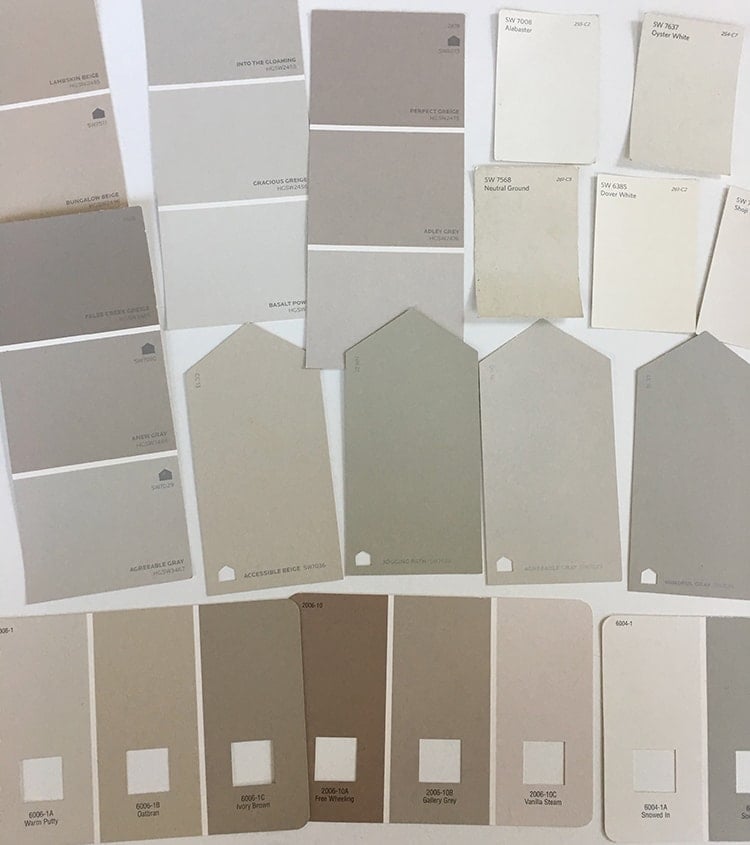
Since the trim is designed to look like stone, I figured a natural gray-beige stone color would be perfect. Enter test samples of my top 9 greiges…
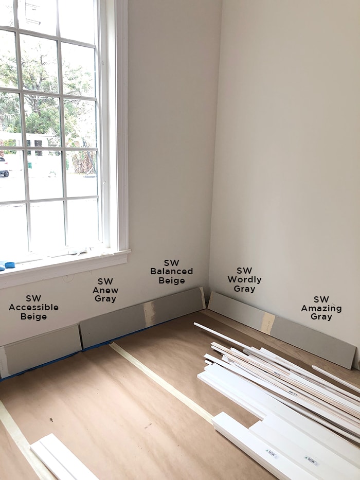
These are my top colors narrowed down after months of research and testing (a few are leftover from the Riverside Retreat paint search). I painted both sides of a few scrap pieces of wood leftover from projects, and would recommend this method because you can easily move these around to different parts of the room to test different lighting. They’re large enough to get a good idea of the results, BUT I’d also make sure to paint the actual surface first before committing 100% (see why below!)
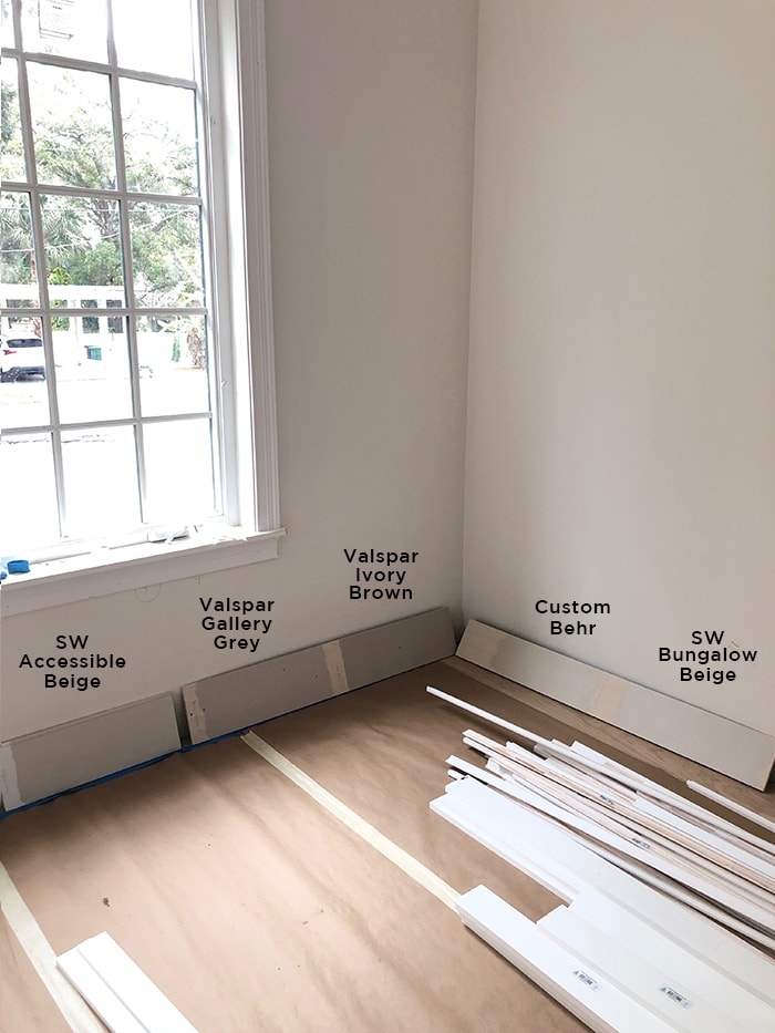
Here’s another round of colors (the no-name custom Behr sample was something I found in an old paint stash, so I figured I’d throw it in the mix).
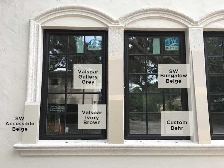
After staring at my options for a while, I was leaning towards Valspar Ivory Brown. These photos are taken at the back of the house though, so I relocated everything to the front.
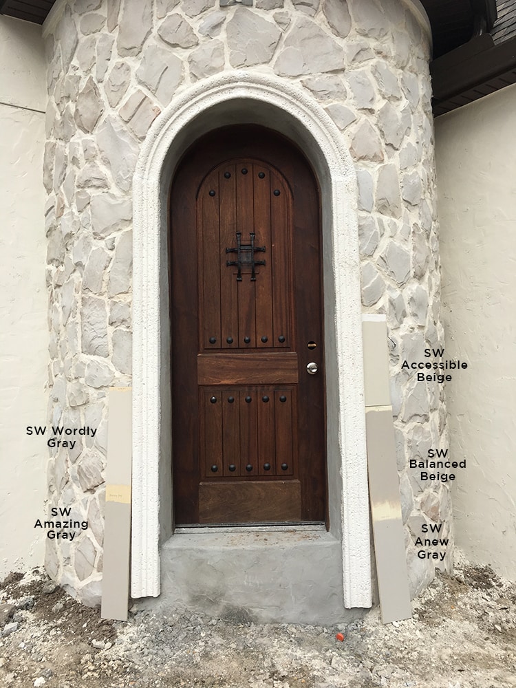
Hmmm… they look a little different next to that stone, don’t they? Being the main entrance and focal point of the house, this area was top priority.
The other factor to consider, of course, is lighting. These shots were taken on a bright day with just enough cloud cover to minimize the shadows. There was no clear winner, so I decided to wait and come back another day.
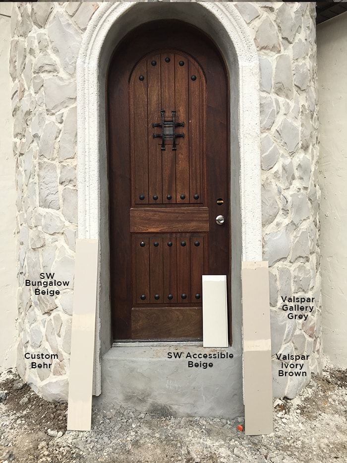
Last weekend the sun was out, and look how different yet again!
At this point, I knew I had to break out the paintbrush and really test them out. The clouds rolled in and I couldn’t believe how different they looked…
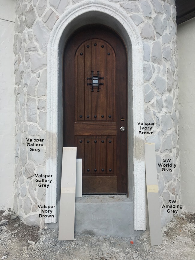
They look so much warmer painted on the trim! Check out the two Gallery Grey’s next to each other in the photo above. Thankfully I didn’t neglect this step, otherwise I’d be regretting my decision!
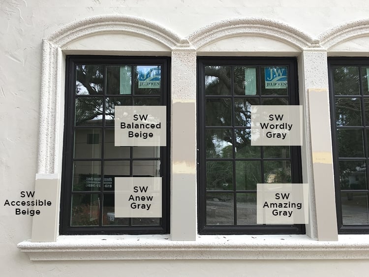
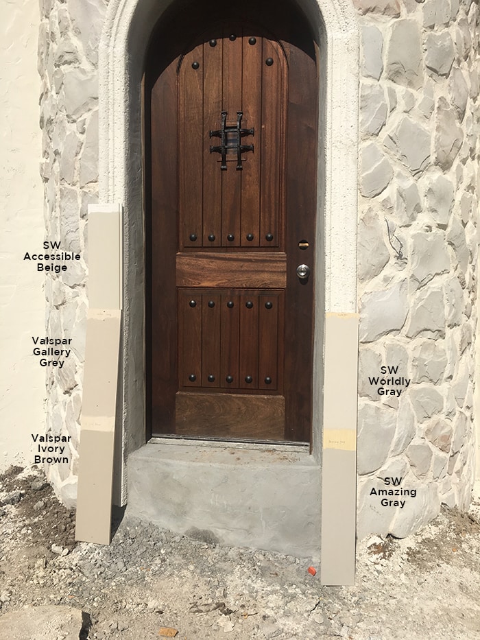
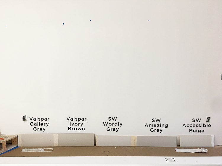
After nixing the two Valspar colors, I gave SW Worldly Gray (top left) and SW Accessible Beige (top right) a shot. And the winner became clear (as seen in my Instagram stories)…
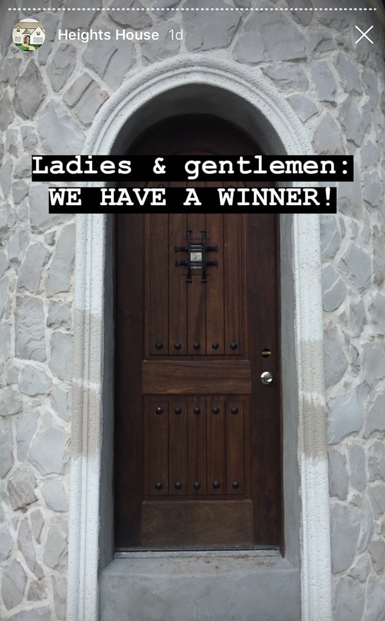
The top left, SW Worldly Gray! It was very close to Accessible Beige (top right), but Accessible Beige had the slightest hint of yellow which eliminated it from the running. Oddly enough, everyone who responded via DM guessed it correctly. I think that confirms it’s the right choice!
Here it is on the window trim. I love that it’s a subtle contrast from the walls.
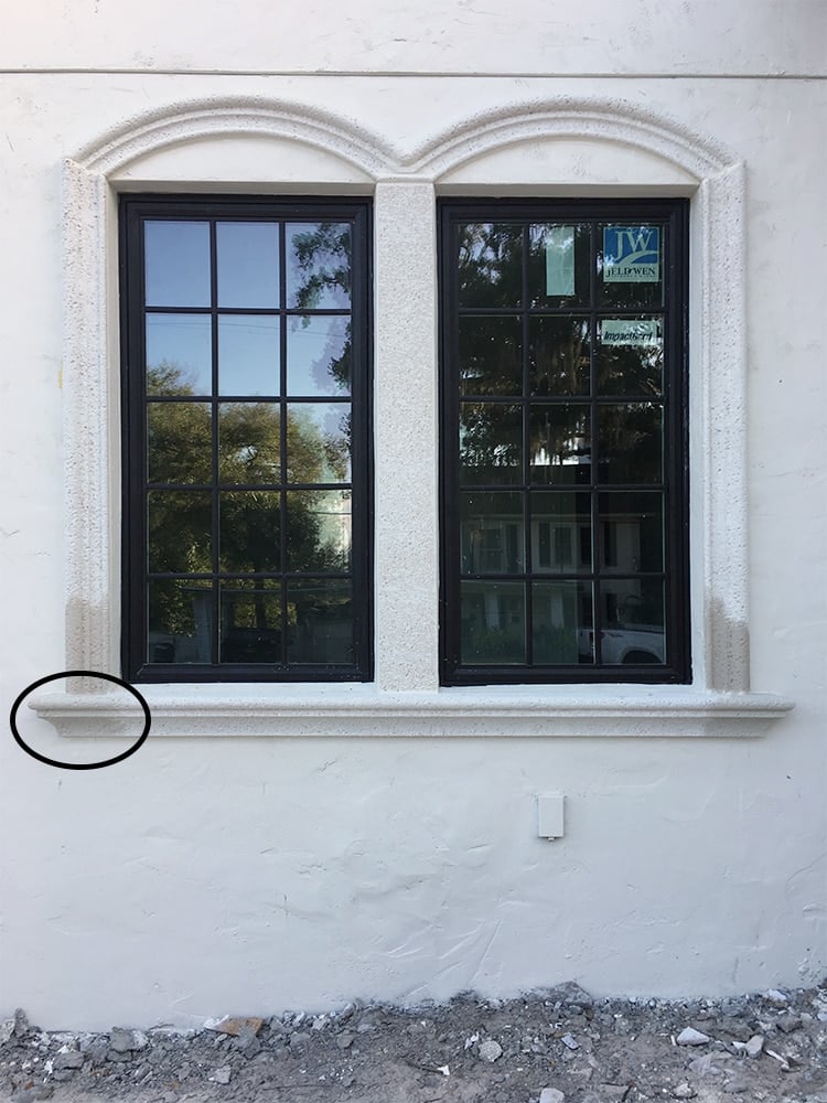
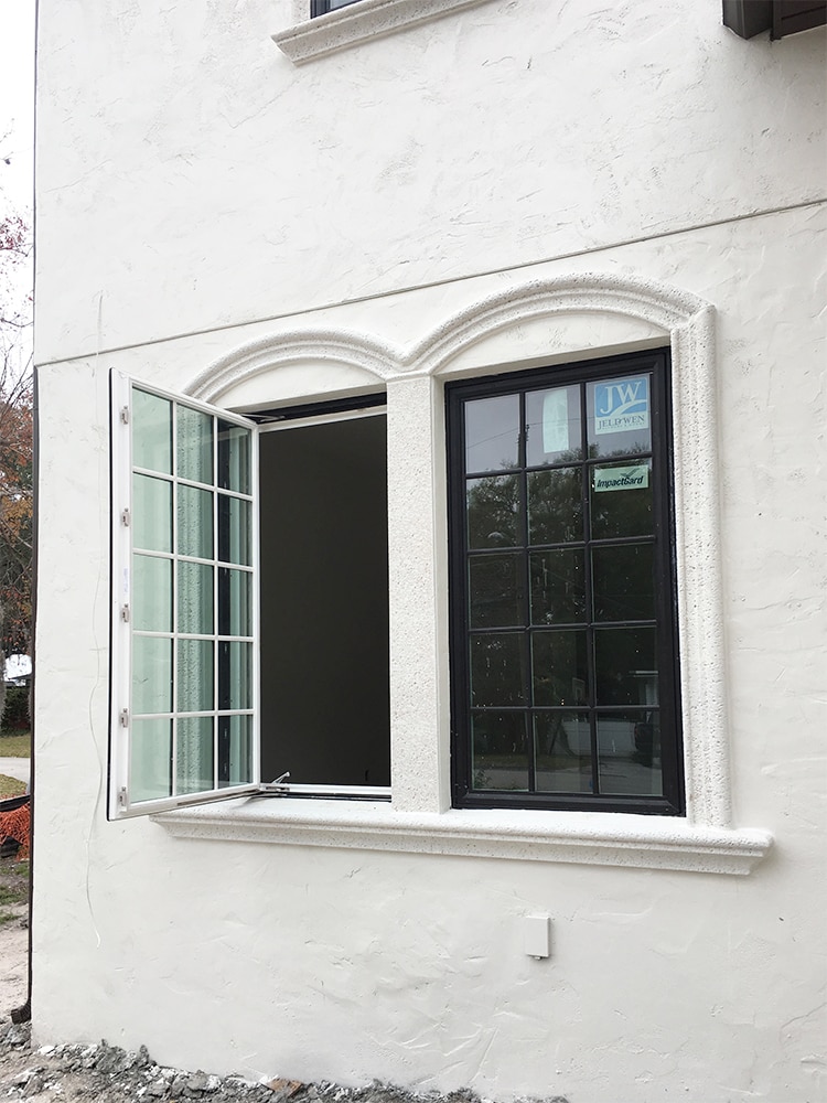
With the exterior walls and trim colors out of the way, it was time to experiment with these window arches. I had mentioned wanting arched windows in my Window Buying Guide post, but they were way out of budget. Instead, I figured I could have my builder add arched trim and then fill in the top with black paint. It worked like a charm…
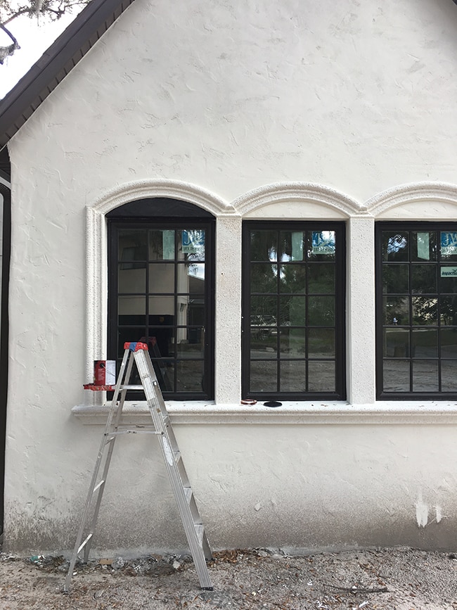
Seriously, even better than I thought. I’m still high-fiving myself for this idea.
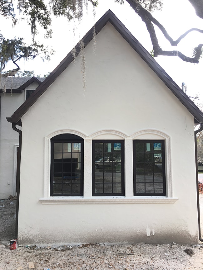
I used SW Tricorn Black which is slightly too dark in person, so I grabbed a sample of SW Black Magic and I’ll be testing that out soon.
Okay, the paint selecting fun continues inside!
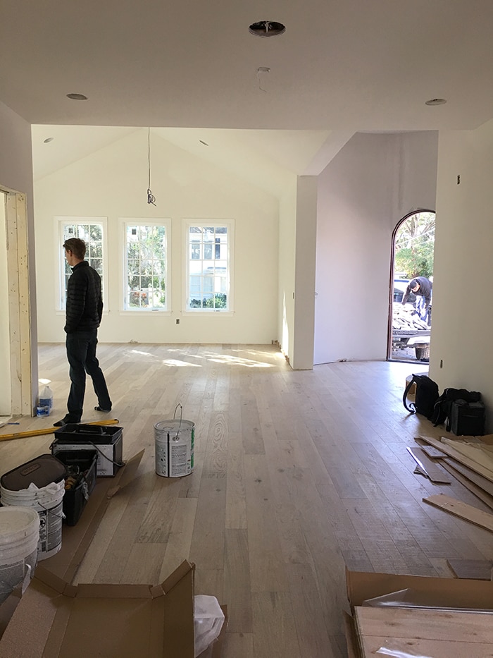
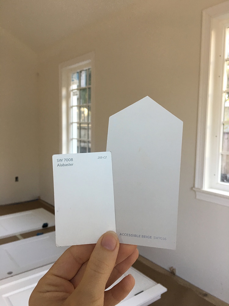
From the start I knew I wanted white walls and light greige trim. I had already decided on Alabaster for the walls, which is a versatile neutral white (not a stark white) and one of the most popular choices by designers. The interior walls have not been painted yet, only primed, FYI.
I used the same greige samples indoors, and no surprise, they look different in every room. The samples are extra useful in here because they look just like baseboards (the doors, door trim and baseboards will all be painted this color).
Same lighting, direct comparison:
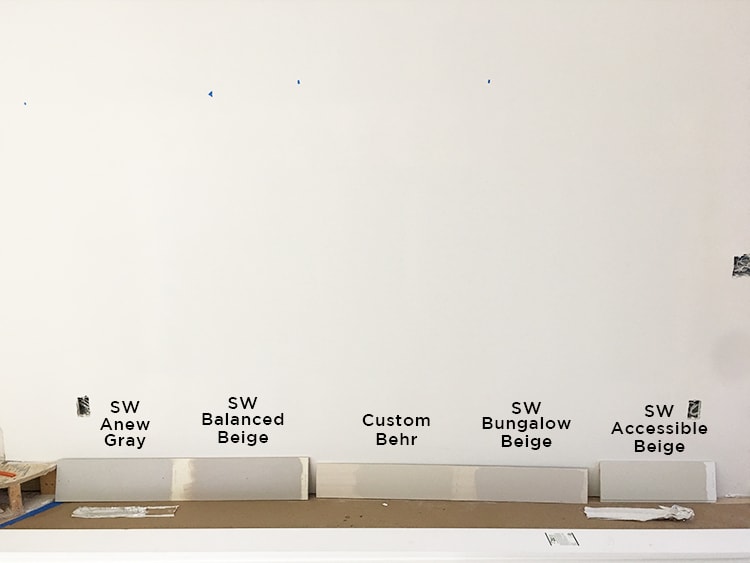
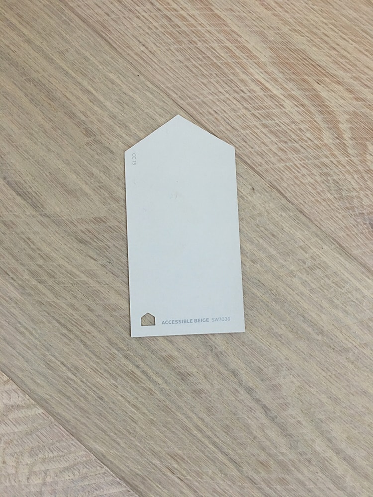
After discovering Accessible Beige a few months ago (remember I used it on our laundry room door?) I fell in love and had a sneaking suspicion I’d want to use it for the trim in this house.
Here’s the samples in the living room, with different lighting:
Now suddenly they’re all dark and gray.
After evaluating how the colors look in multiple areas of the house, I had to go with my initial gut—Accessible Beige. It really is such a versatile gray with no strong undertones (I would say it’s closest to yellow) and I think it’s lovely with the floors (those matter when choosing paint colors!)
I’ll be sure to update this post after everything has been painted so you can see the finished product. Choosing paint is a big decision (especially when it’s exterior paint or walls/trim for the entire house) so make sure to be thorough when testing! Never just pick from a swatch (unless you don’t mind if it looks different on the wall).
I hope this post is helpful to those on the hunt for the perfect greige, or choosing any paint in general. If you don’t want to wait weeks to see the results, make sure you’re following me on Instagram where I’ll share updates as soon as they happen!
Speaking of updates, make sure to check back here Thursday for a special Valentine’s Day post <3


Ruth says
What colour will your ceilings be?
Jenna Sue says
Same white, Alabaster 🙂
Meredith says
What sheen will you be using for the walls and trim? Love these colors!
Jenna Sue says
Matte for the walls and most likely satin for the trim!
Michelle | Birds of Berwick says
Nice! The arch windows outside are so gorgeous! I’ve just finished repainting my whole interior SW Repose Gray after having it been SW Accessible Beige for 7 years. I liked it, I really did, but was craving something cooler and not so beige. It’s definitely on the warmer side of the greiges. I think your design is going to compliment it beautifully!
Nadine says
Give yourself a high five and then do a happy dance. The arched trim idea is brilliant. There’s is nothing better In design than getting the look you want without the high price tag.
Jenna Sue says
Agreed!
Roxanne Morton says
Would you recommend using Accessible Beige on the walls and Alabaster on trim?
Jenna Sue says
Honestly, colors look different in every room and in every house, so you’d have to test it out in your space to see if it works!
Veryl says
Great choices!
Steel Roots Decor says
Those are stunning paint colors. Thanks for sharing.
Kristin says
Hmmm….I find it interesting that the color you chose is called WORDLY gray! Kind of perfect for what has been your story of late and led you to this moment.
Jenna Sue says
I love it when the names of paint colors fit the house!
Kate says
Love the arched windows, the black paint looks so sharp!
Surprised you didn’t have SW Agreeable Gray in the running, it’s a lovely greige that leans more grey than Accessible Beige. Both are great colors!
Jenna Sue says
Thanks Kate! I looked at that one but decided it was too gray.
Christym says
I am surprised you didn’t even consider BM – Revere Pewter. It is the best color ever! after my interior was painted with it, the painter has recommended it to every client looking for the perfect greige
Jenna Sue says
I’ve heard great things about it too! But I knew SW had a good selection and it was easier than going to two different stores 🙂
Lara says
I love the choice of outside trim color!! The arched windows are amazing, and I love Accessible Beige! We used it in our house along with Balanced Beige for variation. Thank you for sharing your adventure of paint selection. One of my favorite parts of new houses.
Jenna Sue says
Thanks, Lara! It took a while to find, but I think Accessible Beige really is the perfect greige.
lilly says
the arched trim to the windows are genius. They look like its part of the window arches!
Jenna Sue says
I can’t get over how great they turned out!